
Appearance
Branding
The Enterprise Data Platform brand uses a data-flow mark, a dark control-plane backdrop, and a blue-to-cyan signal palette. It should feel precise, operational, and trustworthy: a platform that integrates complex systems, governs the data, and turns movement into intelligence.

Primary Assets
| Asset | Use |
|---|---|
| Icon | App icon, favicon-style usage, compact navigation, social preview crops |
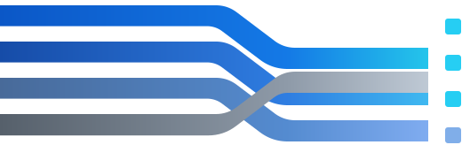
| Data-flow mark | Standalone brand mark for layouts that already include the name |
| Dark wordmark | Preferred horizontal lockup for dark headers, decks, signs, and banners; text is outlined |
| Light wordmark | Horizontal lockup for white or light surfaces; text is outlined |
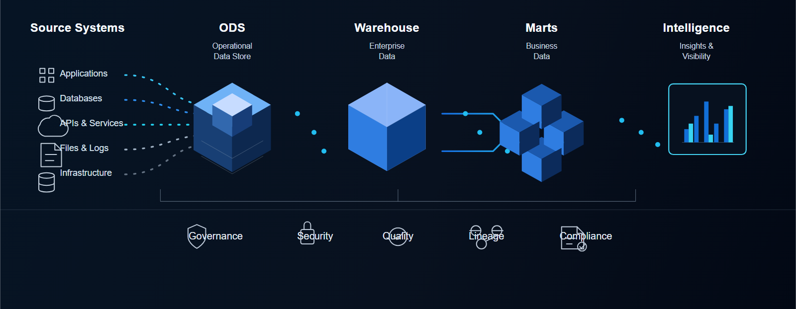
| Architecture flow | High-level visual for presentations and documentation |

Downloadable Assets
| Asset | Format | Use |
|---|---|---|
| Icon 512 | PNG | App tiles, large icon use, profile images |
| Icon 180 | PNG | Apple touch icon and compact app surfaces |
| Icon 32 | PNG | Small UI previews and favicon checks |
| Dark wordmark 1200 | PNG | README, social previews, slides, and dark banners |
| Light wordmark 1200 | PNG | Documents, slides, and light backgrounds |
| Architecture flow 1600 | PNG | Presentation decks and quick previews |
| Favicon preview | PNG | Browser favicon preview; the site also publishes /favicon.ico |
| Apple touch icon | PNG | Mobile home-screen icon |







Logo System

Use the full wordmark when the audience may not already know the platform. Use the icon only when space is limited or the surrounding product context already says Enterprise Data Platform.
Minimum sizes:
- Icon: 24 px in UI, 180 px for app icon surfaces.
- Data-flow mark: 120 px wide.
- Wordmark: 320 px wide.
- Architecture flow: 900 px wide in documents or slides.
Clear space:
- Leave at least one terminal-node width around the icon and data-flow mark.
- Leave at least the height of the
Ein Enterprise around the wordmark. - Do not crop inside the rounded wordmark background.
Color Palette
Midnight
#071525Core Blue
#0B57C7Signal Blue
#1778E7Cyan Signal
#28D7ECSteel Blue
#548BD0Silver
#CAD4DFPrimary surfaces should use Midnight, Core Blue, and Signal Blue. Cyan Signal is an accent for connectors, active states, and data movement. Silver and Steel Blue keep diagrams readable without making every element compete for attention.
Typography
Use Ubuntu for product UI, documentation, diagrams, and presentation assets. The docs site self-hosts the Ubuntu font family from Canonical, and the wordmark SVGs use outlined Ubuntu glyphs so they render consistently.
UbuntuEnterprise Data Platform
AaBbCcDdEeFfGgHhIiJjKkLl 0123456789
Headlines should be direct and architectural. Avoid overly playful naming in platform materials. The brand voice is calm, exact, and outcome-oriented.
Architecture Motif
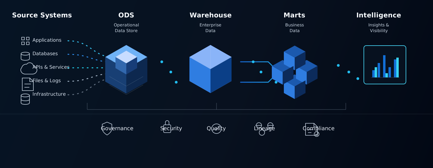
Use the architecture flow when introducing the platform shape: source systems, ODS, warehouse, marts, intelligence, and the cross-cutting controls of governance, security, quality, lineage, and compliance.
Usage Guidance
- Preserve clear space around the mark equal to at least the height of one signal node.
- Keep the four data-flow lanes in the original order: core blue, signal blue, steel blue, silver.
- Use the dark wordmark on navy or black surfaces and the light wordmark on white surfaces.
- Use Cyan Signal sparingly for active data movement, selected states, and emphasis.
- Do not stretch, recolor, rotate, outline, or add unrelated effects to the mark.
- Do not place the wordmark on busy photography or low-contrast backgrounds.
Do And Do Not
| Do | Do Not |
|---|---|
| Use the dark wordmark on dark product surfaces and presentations | Put the dark wordmark on busy photography |
| Use the light wordmark on white or light gray documents | Add shadows, bevels, extra glow, or unrelated effects |
| Use the icon for favicons, compact navigation, and app tiles | Rebuild the mark with different colors or lane order |
| Use SVG assets when the output can preserve vector quality | Stretch the wordmark to fill a container |
| Use PNG exports for README, slide decks, and tools that do not handle SVG well | Place text or controls too close to the logo clear space |
Source Font
The Ubuntu font files are stored under /fonts/ubuntu-font-family-0.83/ for repeatable local and published rendering. Keep the included Canonical license files with the font package.